

|
 |

Designing a Basic Search Interface
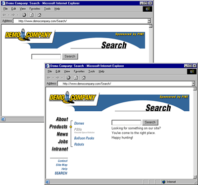
The search facility of a site should look the same as the rest of the site. Often it is not the same because it is added by technical staff, who may not be concerned when setting up the search templates to match the site's look and feel. Users who utilize such search engines may feel they have left the site if the look changes greatly. Look at the two search facilities shown in Figure 9-5; the need for integration should be obvious.
 |
| Figure 9-5. Search pages should resemble other pages in a site |
Rule: Search forms and result pages must match the look and feel of a site.
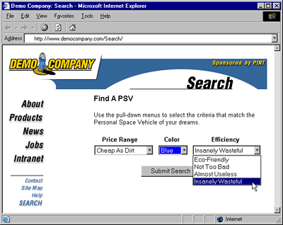
Also, the search form should fit the type of data being searched. For example, if users are searching for objects that are colored, shouldn't the search form provide a way to specify by color? The example search interface in Figure 9-6 for searching for personal space vehicles shows how search forms should match the content that is being searched.
 |
| Figure 9-6. Search forms vary based on content being searched |
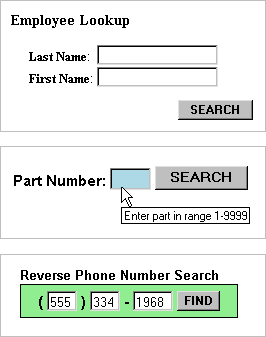
Consider the golden rule of designing a search facility for a site—the more we know about what users are looking for, the better able we'll be to help them find it. One way to do this is to analyze what people search for by looking at the queries they enter. No matter how we figure out what users search for, we need to help users narrow down their search properly. For example, if we are searching for names, try to help people enter in last names or first names into individual text boxes rather than just letting them type names into a single text box. If part numbers are being searched in a range from 1 to 10,000, then let people know that that is the range, limit them to the range, and alert them if they are out of range. A ToolTip set using the title attribute in HTML or a simple JavaScript is an easy way to let people know about ranges without explicitly printing them onscreen. A few search forms that fit the data being searched are shown here:

Rule: A search form should match the content being searched.
The primary element of a search form is the actual search query field. A big question is how long should the search field be. The query text field should be large enough to hold at least a few search terms without scrolling. On average, users type two keywords in search fields.
The size of the search field also is related to the emphasis of the search task for the page. If search is the primary emphasis of the page and users are going to form complex searches, an input size in the range of 30 to 40 characters is common. A survey of the public search engines shows that most use a size of 30, 35, or 40 characters for their primary search field, though Google is much larger at 55 characters. This size makes the search field a fairly large element, width-wise, on a typical page. When search is a secondary aspect of a page, the size should be about half the size—usually from 15 to 18 characters, which should allow a few keywords for a simple query. Of course, the size of the search box should always be designed with the search terms and the page layout in mind.
Suggestion: Primary search text boxes should be about twice as big as secondary search text boxes.
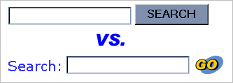
The second aspect of the search form is the button to execute the search. Sometimes a form button is used, while other times a custom button is used. The use of a form button is probably slightly more intuitive for users. The label of the button also varies. Some favor "Search," others "Find," and some even something as simple as "Go." A lot of this depends on the context of the search. If the word "search" is used to label the field, labeling the button "search" seems a little redundant.

The search form should fit the types of users the site is designed for. For example, a search facility for kids might be playful and have few instructions, while a search facility for engineers might contain a variety of fields for visitors to tune their searching. Simple search forms should be separated from advanced ones.
|


